Transparencies can add a lot of value to your printed designs, but it's important to remember that what you see on your computer screen may not always translate perfectly to print. Transparency effects can sometimes appear differently when printed, especially if you don't prepare your files correctly.
When using transparencies in your print designs, it's important to keep a few things in mind. First, make sure to always convert any spot colours or RGB to CMYK before sending your files to print. If you don't do this, some of your graphics or text could drop out from your artwork and create issues in your final printed piece.
Artwork File

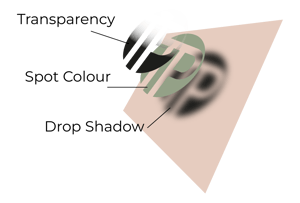
Another important consideration is to avoid using transparencies, shadows or glows on top of a spot colour. This can cause issues with registration and make your printed piece look blurry or out of focus. If you do need to use a spot colour with transparency effects, we recommend that you flatten the graphic, and/or rasterise the file.
When a file contains multiple spot colours, transparencies and other complex elements, it can cause issues when running through a printer system. Files go through multiple checks and programs before it reaches the printer, and if a file has a complex make-up, then it can result in an unexpected print.

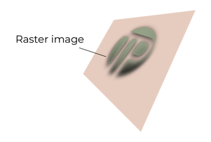
If your artwork does contain transparencies and gradients, we thoroughly recommend that you flatten the artwork, and/or rasterise the file prior to sending it to print. This will eliminate any issues that may cause disruption in your print.